DESIGN
CONCEPT DEVELOPMENT / CHARACTER DESIGN / VISUAL + BRAND IDENTITY / GRAPHICS / INSTALLATION / ILLUSTRATION
In my role as Design Director for Instrument's account with Square, part of my role was to develop impactful visual narratives and consistent language across their brand. In collaboration with in-house creative, we evolved the use of a dynamic glyph library to be used across print, packaging, and digital. This brand system allowed us to share meaningful stories about local businesses, visualize complex data, and inform sellers.
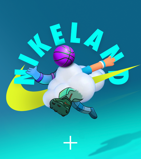
With an elite team of game designers across the world, we built an immense, interactive universe made to inspire play, sport, and creativity. NIKELAND came to life in Roblox through bright landscapes and dynamic character design, using cues from sports, nature, and future-forward technology. We developed avatar abilities, accessories, traits, and interactions, allowing players to add dimension to their Roblox experience. The project hugely successful with 9 million+ visits, featured in Hypebeast, The Wall Street Journal, NPR, and more.
adidas Originals x Coachella; bringing a premium brand experience to the everyday festival goer in unexpected ways was our ask. A festival-wide scavenger hunt for prize tokens, a GIF booth, a pop-up fashion show, and 11,000 pairs of free shoes later, the job was a huge success. Ten brand ambassadors made the literal wheels turn, and the interactions meaningful, and a team of designers, producers, and everyone in between got their hands dirty (like, really dirty). On the last day, an 8 hour line of sweaty but stoked festival goers was our biggest measure of success.
Some of my favorite tee designs over the years, including celebratory tees for Jordan Brand's annual NCAA basketball tournament, Jumpman Invitational, band merch, and cheeky designs for local PDX projects.
An Edinburgh-based leather craftsman with a knack for all things lounge-in-cheek came to me with a clear vision, a strong brand identity, and went by the name
of ‘Deadhorse’. He wanted an illustrative logo that spoke to the heritage of his craft, a heritage which is central to his everyday working practices focused on primitive and traditional construction techniques. In addition to the hand-drawn logo, a primary and secondary word mark are part of the brand graphics kit. Secondary and tertiary marks are explored, joining an old photograph of Edinburgh to create key visuals.
House Party
My family comes from West Belfast, Northern Ireland. These works are an exploration of my time there with my family, a commentary on the everyday over layers of suffering and turmoil. Tongue in cheek, these fast, emotive illustrations capture my experience. West Belfast Is For Lovers.


